Introduction
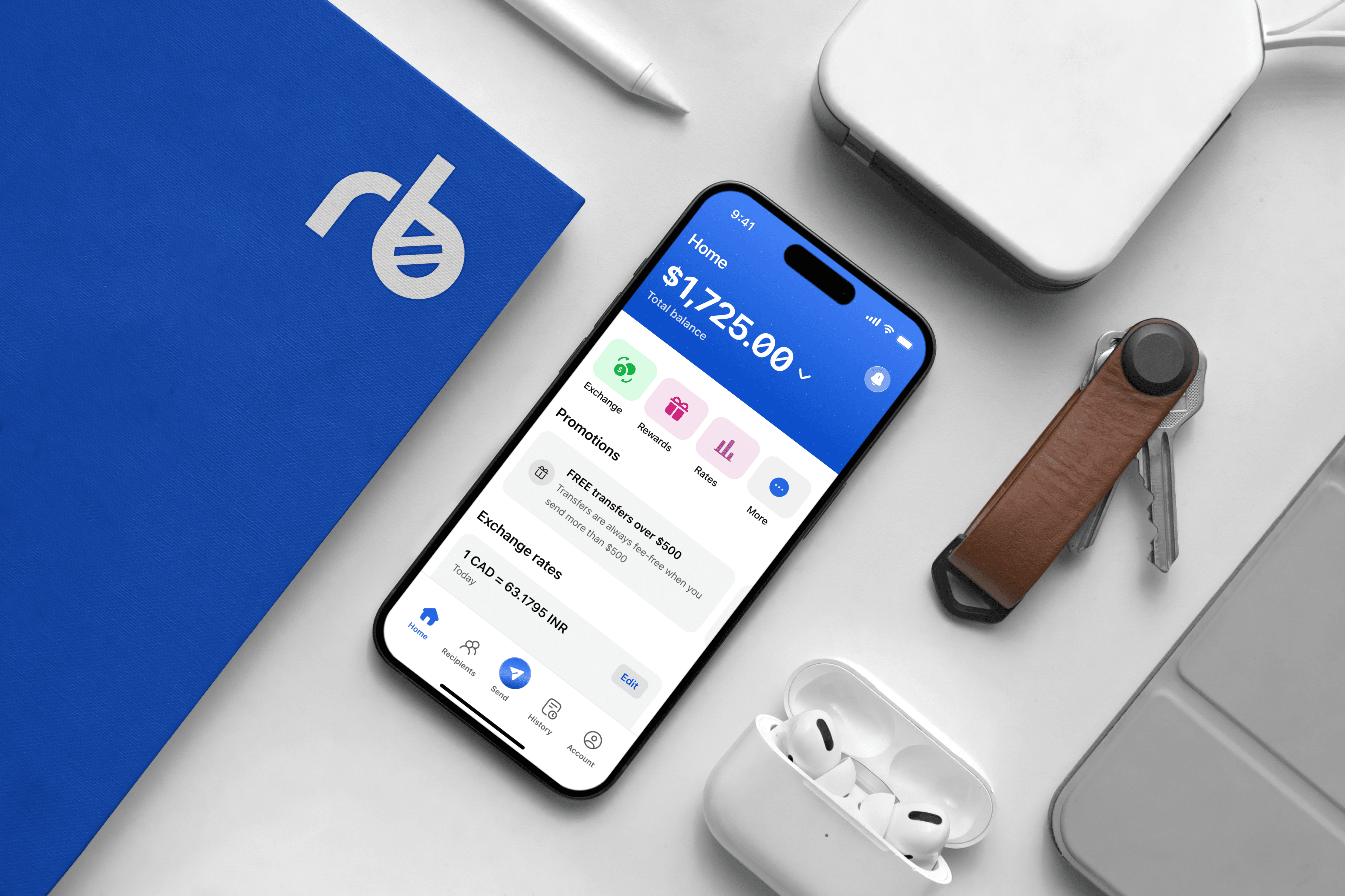
For Hatton’s mobile banking app, I created an easy-to-use interface that helps people manage their finances, investments, and cryptocurrency all in one place. The goal was to keep the app clean and straightforward, so users can quickly access their accounts without feeling overwhelmed.

The Design
The main screen gives users a clear view of their account balance, recent transactions, and quick actions, like sending money or checking investments. I used bright colors like yellow and green to highlight important buttons, making it easy to find what you need with just a glance.
I also focused on making sure the app feels safe and trustworthy. The layout is clear, with large, readable text so users can easily track their spending and manage their crypto. The wallet feature brings together credit cards and rewards in one place, making it simple for users to see everything in their financial life at a glance.

Overall, the app is designed to be user-friendly, allowing users to manage their finances with ease and confidence. From tracking expenses to monitoring investments, every feature is placed intuitively so users can find what they need without unnecessary clicks. The navigation is clear and simple, reducing any learning curve, so even new users can feel comfortable using the app right away. Though the app offers a wide range of features, like cryptocurrency tracking and budgeting tools, it never feels complicated. It’s built to feel lightweight, focusing on what’s essential without overwhelming the user.

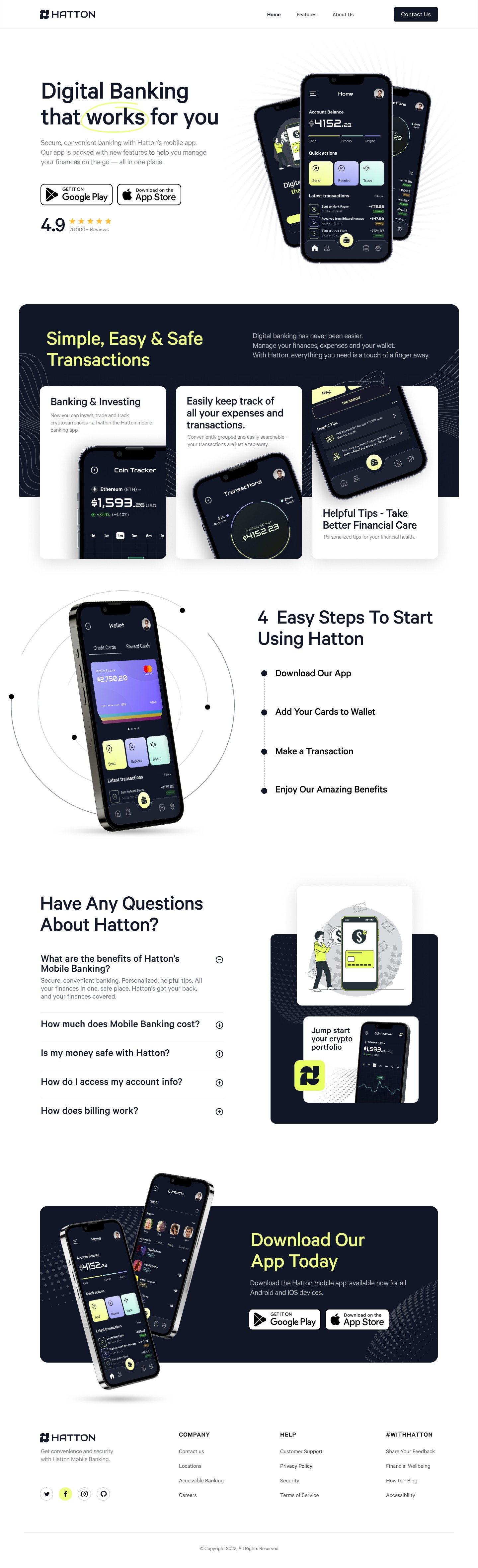
Landing page
For Hatton, I also designed a modern, user-centric landing page for their mobile banking app that prioritizes simplicity, trust, and ease of use. The primary goal was to communicate the app’s value and features in a clean and engaging way while making it feel secure and approachable for potential users.
I combined clean typography, bold calls to action, and structured content sections to ensure seamless navigation and clarity of information. The header introduces Hatton’s key message, accompanied by app store download buttons and a high user rating, which immediately instills trust. The overall design uses a minimalist approach with ample white space, making the layout breathable and easy to follow. Bold, eye-catching icons, vibrant imagery, and contrasting color accents (such as yellow and green) draw attention to critical app features, like “Banking & Investing,” “Coin Tracker,” and “Transactions,” showing users how Hatton simplifies financial management.
I focused on user onboarding by creating a "4 Easy Steps To Start Using Hatton" section, which breaks down the process into simple steps, reducing friction and making the app more accessible to first-time users. Additionally, a responsive FAQ section was included, offering answers to common questions in an organized, expandable format, adding to the page’s overall utility and user-friendliness. Finally, I used engaging visual mockups of the app in use throughout the page to give users a glimpse of what they can expect from the app experience, reinforcing Hatton’s functionality and reliability.