The challenge
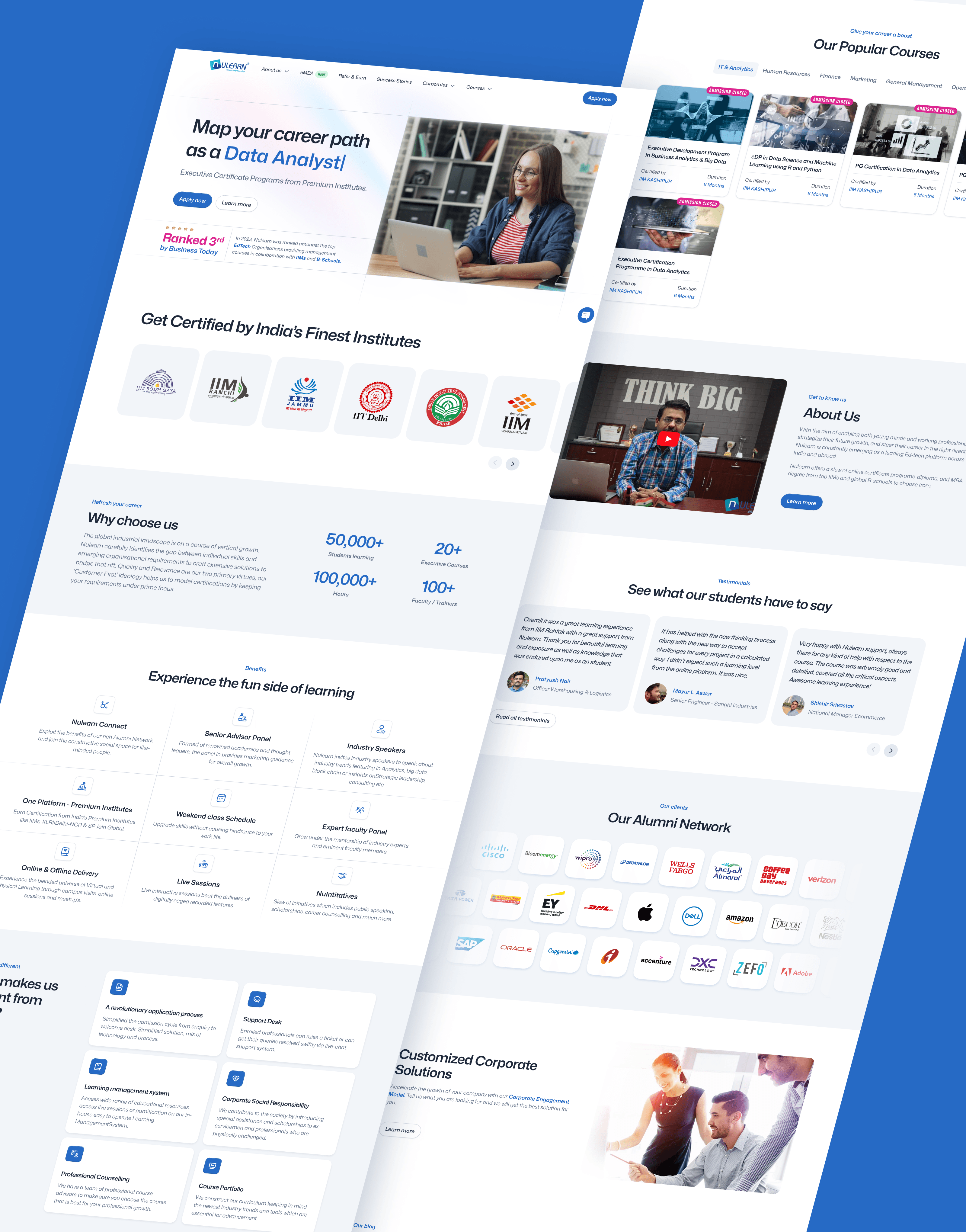
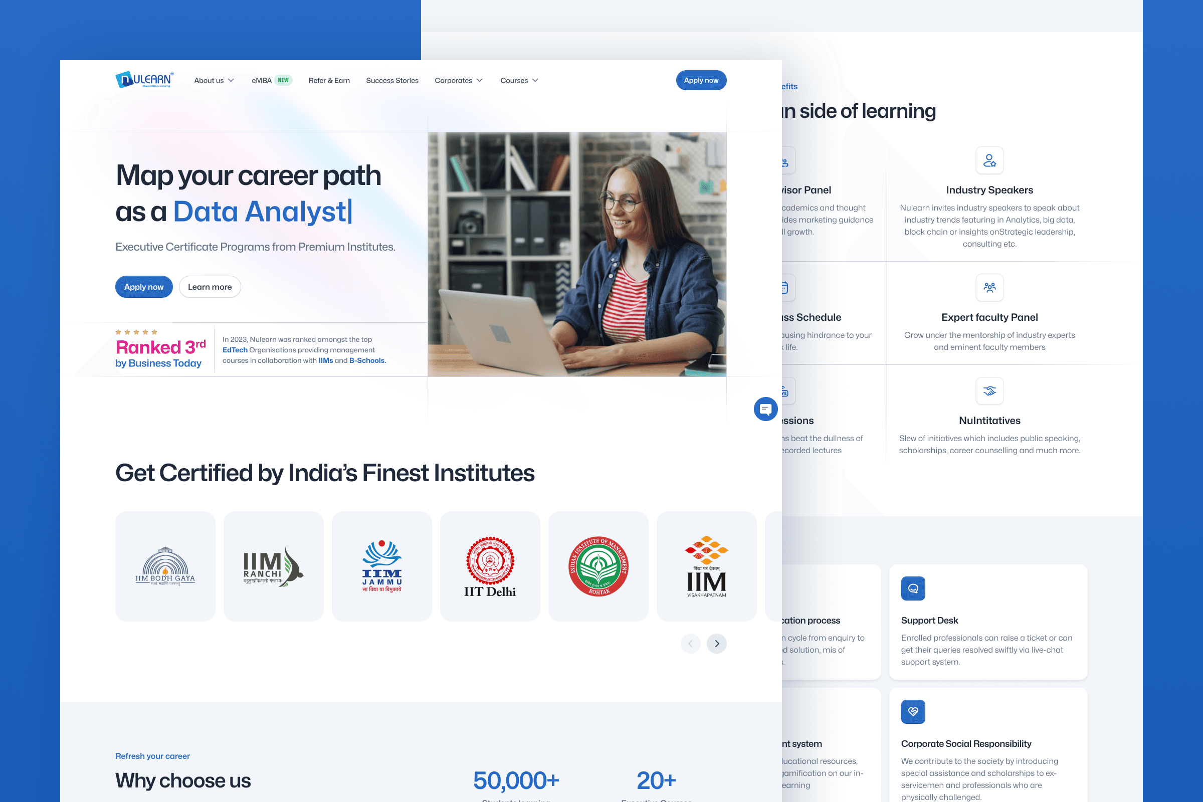
I was tasked with redesigning of Nulearn landing page. Nulearn is an innovative educational platform which offers courses and programs that help you advance in your career. The goal was to simplify the design and make it easier to browse through, which helps increase conversions. The biggest challenge was to keep existing content but make it much more accessible and clear to the user. The page is content-heavy and the way information is displayed plays a crucial role in grabbing users attention and not overwhelming the user.
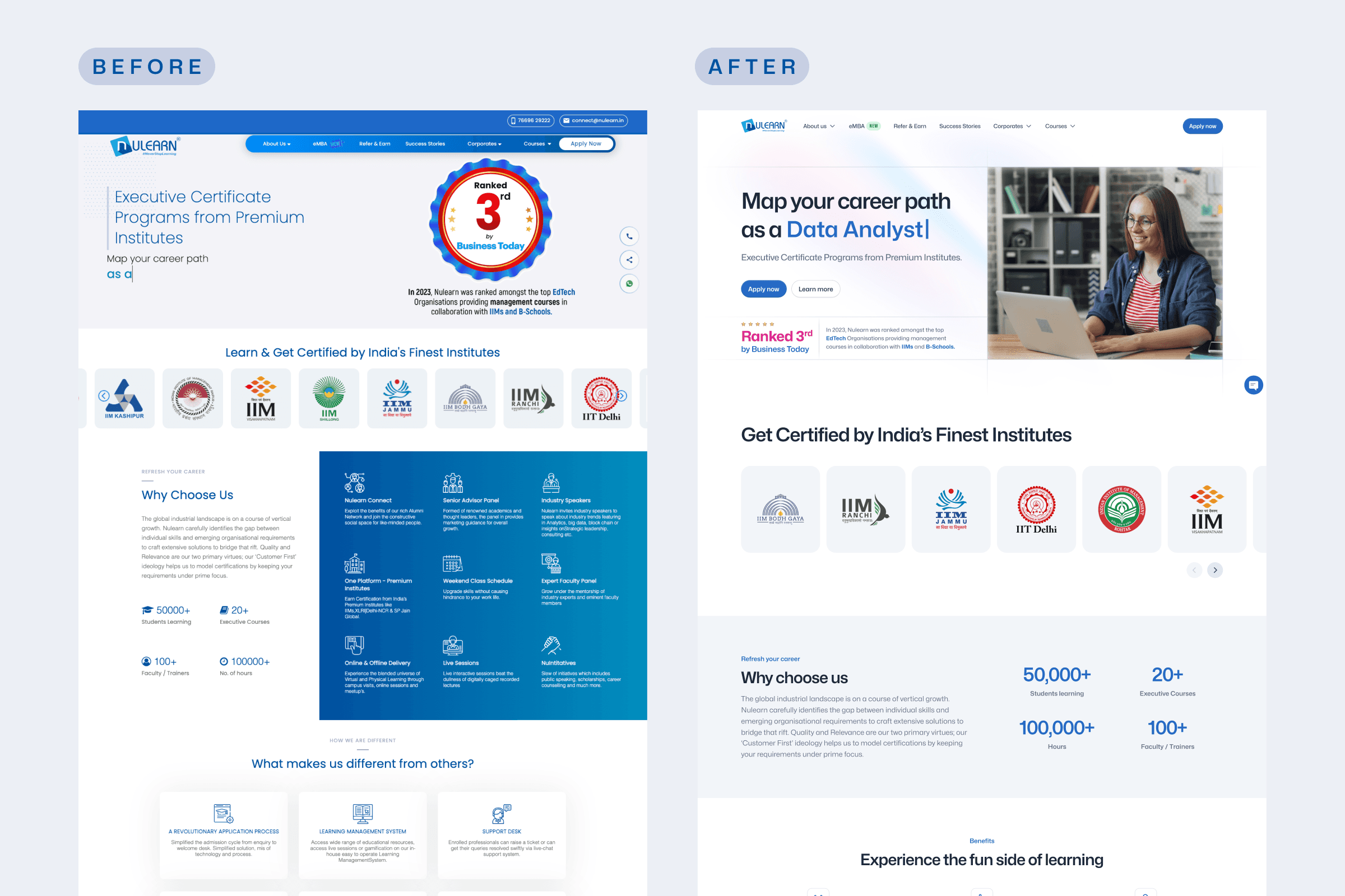
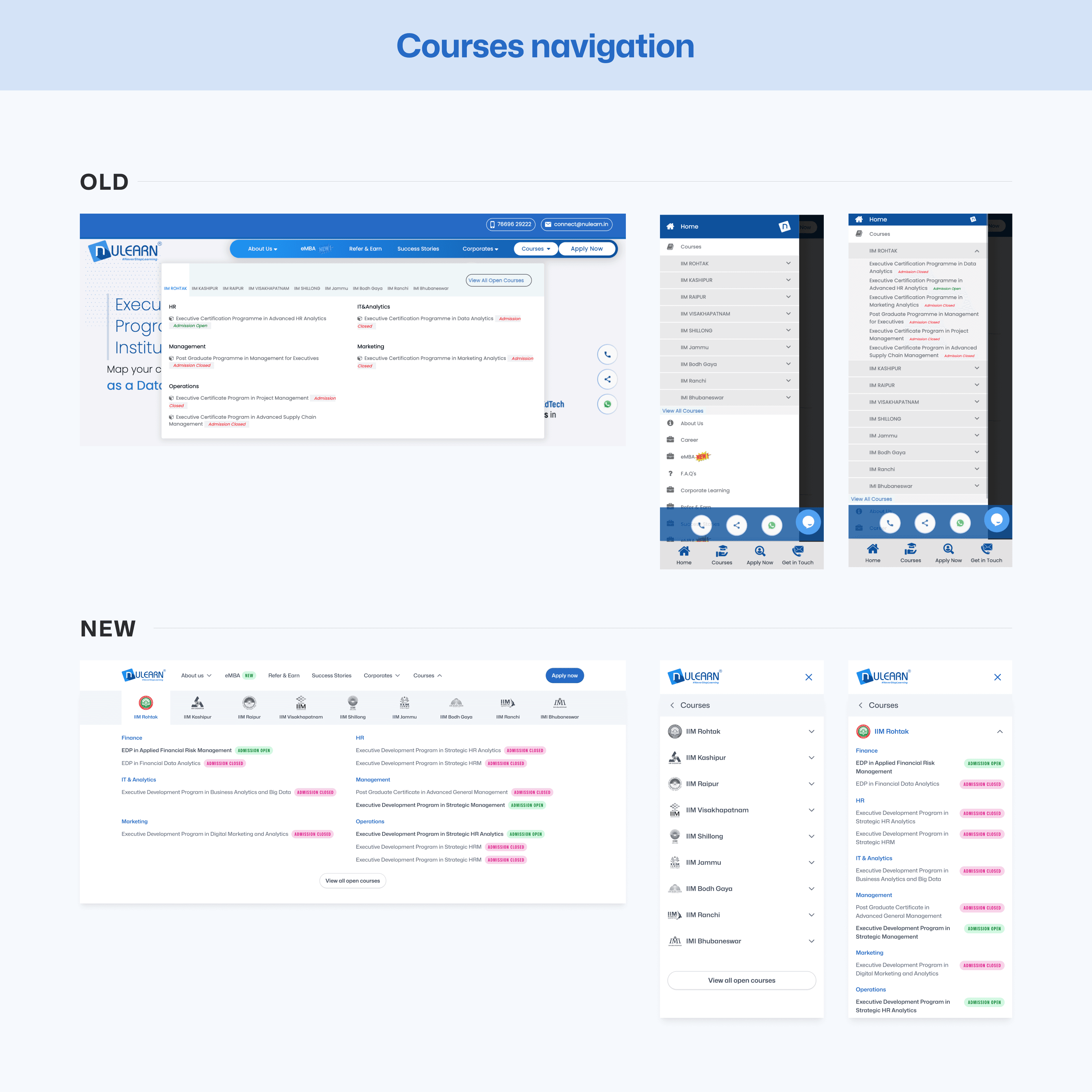
The first thing I tackled was Hero section - mainly Navigation bar, which was very poorly optimized for mobile devices. My goal here is to remove all the unnecessary elements and clean up the navigation for mobile users (which is a major percentage of users in India for any platform).
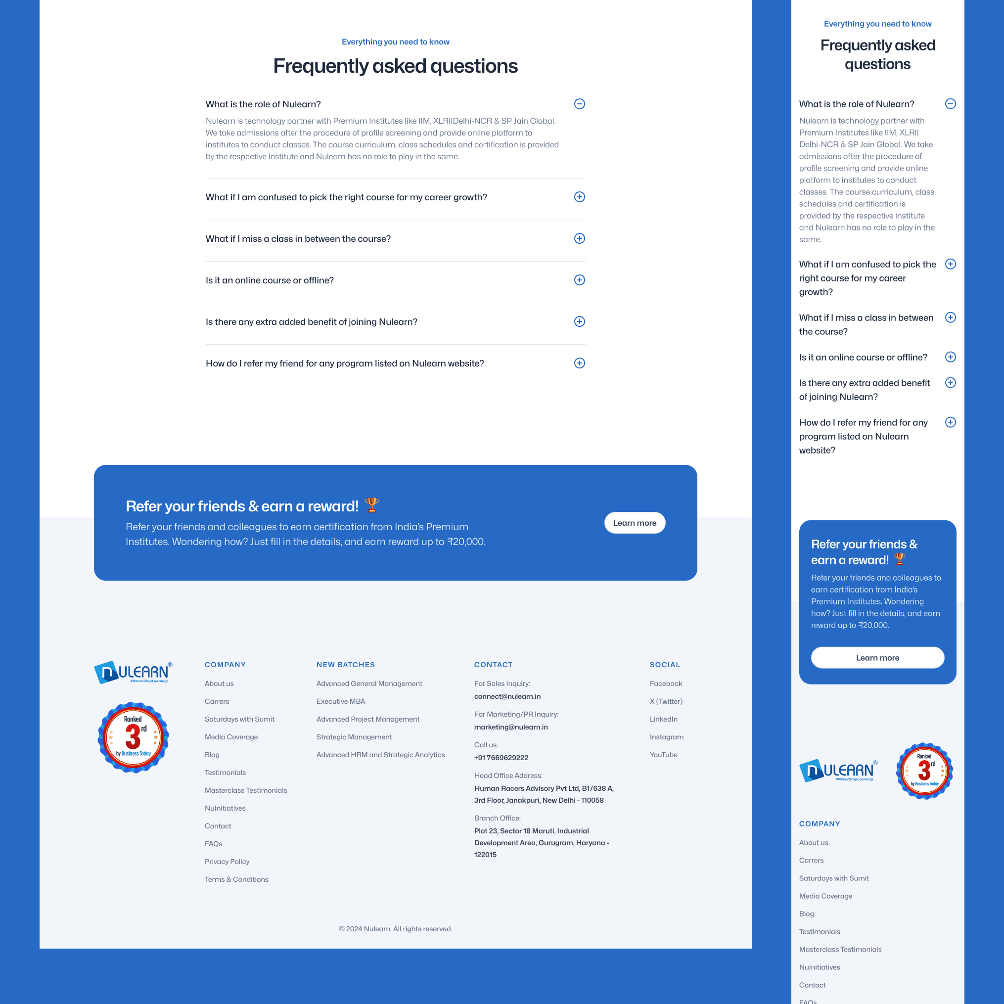
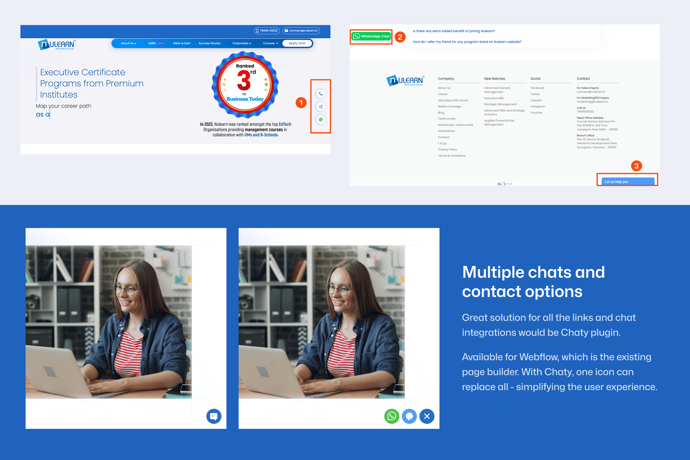
Another issue I've noticed is the multiple ways to get in contact and share the experience. The current construct is extremely confusing - which makes the platform appear less professional and trustworthy. Inspecting the web page, i've learned that Webflow was used as the main page builder, which allowed me to quickly find the solution. This lead me to create a protoype design of the plugin Chaty, which can accomplish the same function with minimum design elements added. With one icon, users can now achieve the same thing (and more) than previously possible.
Overall, the design is greatly simplified and key information is highlighted in a much clearer and concise way. During the process, I've established a clear typography style, colour system and reused proper design components throughout the whole page. Consistency, simplicity and clarity - three pillars of this redesign that accomplish the main goal of this challenge.